Monday I turned in my Graphics design that I showed you last week, but the instructor didn't say much about them so I don't know if I did well or totally missed the boat on this one. We then we went over our next assignment where we had to pick a word from a list, find words we associate with it and create images. Our homework was to find 30 words and create 15 images. I chose the word Bias, and created images using the 3 different definitions of Bias. One relating to fabric and bias or angled edges, one relating to sports, like the bias that a spit ball has when thrown, and the last bias is the opinions/feelings/actions people have about others when they have preconceived notions. The instructor didn't like any of my sketches. The only one that came close was a sketch of the police stopping someone by the side of the road. But he wants me to change the viewpoint. He wants it so our point of view is inside the car, seeing someone driving, with a police car coming up behind them in the rear view mirror. I can work with this, but am having some second thoughts about how good a fit graphic design is for me. I really have a hard time with metaphor and he loves it.
On a happier note, my Typography Letter design was posted in the hallway, so that one works. And some of my Color and Design studies have been posted along with other students work.
In Typography we have moved into the Computer lab and we are working with Quark learning how to manage fonts in a document. There are rules that we need to learn about spacing. Spacing in typography is critical, not just line spacing, but the spaces between words and letters. Very subtle stuff, and it means there are no images for me to show you.
My Color and Design class has completed the study of color and we are moving on to the study of space, and how artists create the illusion of space in their art works. Our first assignment having to do with space was to do a pen and ink drawing showing spatial indicators. Those indicators are: sharp and diminishing detail, size, position, overlapping, transparency and interpenetration. Interpenetration is when an object goes through another object and comes out the other side. Below is my drawing for this assignment, I included everything pretty well except for diminishing detail. I do have to say that I don't feel it is all that well executed. I may be doing a lot of figure drawing, but my object drawing skills seem to be a bit rusty.

Objects are a pear in a glass bowl, cheese being cut by a knife, a cup
with another pear in the distance.
Drawing this week was from projected photo's and in the second part of the class we moved on to a discussion of the arms and hands. We did a couple of hand sketches and our homework is to do more drawings of arms and hands, including one of the bones of the arm and hand. My first image for you is my homework from 2 weeks ago, here is my study of the bones of the torso, including the rib cage and pelvis.
I did this with pencil, charcoal is just too soft for me to get the detail I want


These are from photo's our Instructor took of a Model he likes to use. Because we didn't have a live model we had longer to work on each image, so these are more finished then my live studies.


My Hand studies, not wonderful, but not too bad, at least you know it is a hand.
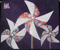
My last image for you this week is of the Spinners mini quilt I did for one of the FFFC challenges. I have added more beads, lightened the center spinners light fabric by using Shiva paint sticks and added the Japanese character for Wind. Hopefully this has helped improve the overall design, by moving the middle spinner a bit more to the foreground and keeping your eyes from totally going off the quilt surface.
As always comments are welcome. Next week is our spring break so there won't be any drawing images for you. But I have Color and Design homework and hope to have finished my February FFFC challenge quilt.

No comments:
Post a Comment