Sunday, September 28, 2014

Plants, more in Transit drawings and a MFA visit


Another week, another trip into Boston. Again I had to wait for the Bus, not quite as long a wait as last weeks but I did wait. This week I drew one of the buses pulled up in a bay near one of the marker stanchions. Not wonderful, but not too bad either. Graphite in my sketchbook, I am using a mechanical pencil with a B lead, it works OK, but I find it a bit frustrating as while it is a fairly thin lead (0.7mm) is also isn't as pointed as I can get my leads when I sharpen them and I miss having that sharp tip for details.


A fellow passenger on the Red Line into Boston. While in a way I am happy that most passengers occupy themselves with their smart phone/readers/tablets whatever, meaning they never notice I am drawing them. It does give me a skewed look at their faces (tilted down), which isn't always the view I would prefer to draw. Oh well, I will take what I can get.

I rather liked the cap and wish I had done a slightly better job of it.


Some of the rose bushes the city has planted along the edge of a parking lot are producing the largest rose hips I have seen. Anyway the above pen and ink drawing is of one of them portraying two different views, side view and top down. Just a quick sketch with one of my technical pens in my sketchbook.


A quick sketch of a small flower/plant that I picked on my walk to the bus station. I don't know what it is as I didn't recognize it, a light purple flower with more rays than petals. I don't think it is a wild flower, maybe some kind of herb escaped into the lawn.


At long last (it has been about a month) an update on the Mandala I am working on. I finally made some decisions about the outer ring, have the poppies drawn/inked in and have started coloring them. I have also started drawing the other decorations that will go into that ring but so far haven't started inking them. That job really needs to be finished soon as I can't start on the backgrounds until I have finished inking and erased my pencil lines. Still quite a bit of work to go, but I am making progress.


Above are two photographs from the MFA Bright Matter exhibit. The top is an installation work that was set in a room by itself, painting on mirrors that reflect the bright lights onto the walls casting shadows. The bottom two images are paintings/collages that are a contrasting pair.

The artist is Shinique Smith and she uses a lot of fabric in her art. She not only collages fabric into her paintings but creates soft sculptures with stuffed animals and clothing she has acquired. I have a feeling she is a frequent visitor to her local thrift/second hand stores.

I didn't expect to like her art, there is a lot of modern art that I think is really junk that is being called "ART" by some supposed "expert", but I did. I love her use of color and the curving lines that she tends to use appeal to me.

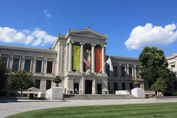
I did a lot of wandering around the MFA on this visit, trying to get to know the old wings and the new in relationship to each other. I think I saw most of the special exhibits even if I didn't take time to examine them on this visit. Course the museum is so large that I think it will take me quite a few more visits before I become totally familiar with what is where and can find my away around without getting a bit lost.


Last image today is of a Sugar Maple that is growing in my neighborhood. It is obviously changing colors, with these glorious reds and oranges. Coincidentally the colors here are repeats of the colors used in one of Shinique's paintings above, cool blue (sky) hot red orange (leaves) with dark branches instead of black lines.

I have a feeling the owners of the house/yard where this tree stands have no clue it is a sugar maple. I have to wonder if the original owners used to tap their tree in the spring.

I worry about these trees, here in MA we are getting toward the southern range of the Sugar Maple, they like cold winters and I worry that with global warming these trees with their beautiful fall color won't survive in my area.

Just a FYI the only thing I did to this photograph was to crop it, colors are pretty much as they are in real life, enjoy.

That is it for today, per usual comments are welcome.

Sunday, September 21, 2014

Drawings in Transit, and a Bumblebee


Went back into Boston last week and had to spend some time waiting for the bus at the bus terminal so made some drawings. Above is a woman who was also waiting sitting on the edge of one the plant enclosures at the terminal. The shoes were semi blocked from my view so I sort of winged them. I rather like the upper body areas.


A quick portrait of a woman who was also waiting for the buses. In Brockton the buses try to leave from the depot at the same time, they all don't arrive at the same time off the routes but they try to time them so they all leave at the same time, makes it easier on passengers who have to transfer from one bus to another.

I am a bit rusty when it comes to portraits so need to spend more time doing them. Still for a quick sketch I somewhat captured her look.


The one above I drew on the train into Boston, she was so intent on her device that I don't think she looked up more than once, and I know she wasn't aware that I was drawing her.


Pen and ink drawing of another of the white fall asters, I am fairly sure that this is the Toothed White Topped Aster, or perhaps another variant of that type. I am not very happy with how the flower heads came out, too dark and not really clear enough. One reason why you see several attempts at drawing them. Will have to try again on another day. Graphite might be a better medium for this plant, but I needed to play with the technical pens so I chose to use them.


During my Boston trip I visited the large Dick Blick store on Park (they have Polychromos pencils open stock), then walked up Park along the Fenway to the MFA. In the Fenway green space I found several art Installations. The photo above shows one of a series of plaster castings/sheets with a figure emerging from the ground. Another installation was of colorful tree like sculptures placed among the trees. Another had what looked like three concrete pillows arrange by some bushes, and there was another of objects hung from trees. I may have missed at least one or two but it was sort of fun to discover art where I didn't expect it.


At the MFA I visited the Hollywood Glamour of the Silver Screen Exhibit. The exhibit includes both dresses and jewelry that was worn or owned by the stars of the movies in the 1930's - 1940's. The exhibit isn't very large it all fits into one room, but it was fun and I felt it was worth my time. 

Above is a photo of some of the dresses on display. In the background you can see the screen where they showed clips from movies of that era. I have to say that the designs they selected are pretty timeless, some of them I wouldn't mind owning and wearing.  


These last two photos are the last of a series I made of a bumble bee that was visiting this rose. When I first saw the rose the bee was deep inside and I could only catch glimpses of it moving around. The shot above shows it emerging from the center. The one below while it looks like the bee is arriving is actually of it leaving the rose.


Obviously I see a lot of bumble bees visiting flowers but rarely get as good a photograph as these so I wanted to show them off.

Monday, September 15, 2014

More plant drawings, and line comparisions


Going to be a fairly short posting today. Above is a graphite sketch of some leaves with yellowish berries. I fear I did a bit of vandalism as I picked this short branch to take with me as a reference for this drawing. As the bush this comes from is rather over grown I think my vandalism can be excused and won't even be noticed.

Done in my sketchbook with a B grade lead. I suppose I could have spent more time on this, but am still rather pleased with the outcome. Not sure what the bush is, if I find I have some time and the inclination I will try to find out. Right now the berries are yellowish but I am not sure that is their final color so I will be keeping an eye on the bushes to see.


A small stem of small white asters. I made this sketch with one of my technical pens directly, no pencil drawing first. The plant this comes from is just being opportunistic growing in a waste area, wild flowers in the city.

Both of these drawings were done in one of my sketchbooks and are more or less studies, these studies are a way for me to keep my hand in while I work on other projects.


A photo of my work in progress of the leaves I started a couple of weeks ago. I have been spending my time since that last update on this working on the stipple background. It probably still needs more work in areas but I was beginning to get impatient with it so decided to start adding color. I am using colored pencils as the paper I am using (Bristol Board, velum) isn't at all tolerant of water.

Each leaf size will be a different color, the largest is yellow, the middle sized leaf is blue and the smallest leaves will be violet/purple.


You are probably wondering what the heck the above image is. It is me drawing lines using the various pens/nibs that I use in my drawings. There is a discussion over in the WetCanvas Pen and Ink forum about how an artist got his fine lines. The way many pen and ink artists work when the work is intended for publication is to work large, then when the image is reduced the line work appears finer than it really is. Another way is to actually use a pen/nib that creates a fine line.

I prefer to work with a fine pen line myself so decided to compare my various tips/pens to see which were the finest. The winner is the Rapidograph technical pens, exp. the 3X0 and the 4X0 tips. I used the 3X0 for the stippling in the leaf work above. It takes a while to achieve a mid-tone with that size tip, but I really like the look so I use it.

Next thinnest would be the Micron 005 pen. But I have found that the last few Microns I purchased just didn't seem to hold up as well as they used to, so I currently prefer my technical pens.

Last are my dip pen tips, I really need to get some new nibs as I am fairly sure there are some on the market that will make a finer line. However, I am going to have to order them on-line as none of the Brick and mortar stores I visit carry what I am looking for.


I believe this pretty white flowering vine is Sweet Autumn Clematis. I have no clue how this vine came to be growing where it is, in some trees next to a stream prior to it going under a roadway, esp. as the area is not currently a tended garden. From the abundance of white flowers it seems to be doing quite well and is happy in its semi wild location. Since this is not a native species I expect that at one time there was a garden in this area and the vine was planted then, or maybe not, perhaps it is just a volunteer, or maybe there is a secrete gardener who planted it in the dead of night, can you tell I am finding it fun to speculate?

Anyway that is it for today, per usual comments are welcome.

.

Tuesday, September 9, 2014

Sketches and a visit to the MFA


One day last week I went into Boston to visit the MFA (Museum of Fine Arts) because I hate driving in Boston I took public transportation. To entertain myself on the trip I made some sketches of people and a tree I could see at stations and on the trains. Above is a woman waiting. She is very sketchy but I am not totally displeased with how it came out.


At the Red Line stations while waiting for the trail to leave I could see a tree, not a totally successful sketch, but I was starting to get there. Below the tree is the face of a fellow passenger on the train, he had headsets on and was listening to music. Again very sketchy, but also a bit of a likeness.


Above is a photograph of the entrance of the MFA with banners for the Jamie Wyeth exhibit which was my reason for heading to the museum. Talk about a post card photograph, blue sky with just a few white clouds, not my usual style, but every now and then I manage one of these. As an aside they have to be watering the lawn as most places have very brown grass at this point in the summer as it has been fairly dry.

I must say I enjoyed the exhibit immensely. It is the first major retrospective of Jamie Wyeth's art and they certainly have a range, from some of his earliest works (drawings he made as a child) to some of his most recent, Sea Gulls representing the 7 deadly sins, in watercolor on archival cardboard. They had two of his wild sheep paintings some of his portraits (including the exchange portraits he did with Andy Warhol) and some of his drawings of Rudolf Nureyev. He was friends with both back in the 1960's. What I found interesting is that in his early portraits he was looking for total accuracy, even to using calipers to measure distances, while some of his most recent work has become quite impressionistic. All of his paintings have power, and I enjoyed viewing them all, but I admit that I am just as happy that he is no longer a slave to realism.

I gather that the exhibit received mixed reviews, but then Jamie like his father and grandfather before him have received mixed reviews from the art critics their entire lives. He doesn't care and I admit that I don't either, I enjoy looking at what all of them create despite the critics. So if you are in the Boston area while the exhibit is going on I urge you to stop by for a look.


A couple more of my from nature sketches above is a seed pod from a Sweetgum tree. The other items are the actual seeds and debris that came from inside the pod. I have drawn the seeds slightly larger than life in order to depict them in more detail.

MA is about as far north as the Sweetgum will grow, this tree was planted by the city to be a street shade tree.


The seed pod above is from a Copper Beech tree that is growing in my neighborhood. This is a huge old tree, the trunk is many feet around, and looks to be in need of a tree service to check out how healthy it actually is. Oh well Copper Beeches are not native North American trees but were planted as ornamental trees by our ancestors.

Each pod contains 2 seeds, though I have drawn only one of the seeds that was contained in this pod. Exterior of the pod is hairy and dark brown.


A couple of quick pen and ink sketches of a miniature rose blossom, side view on top, and a top view on the bottom.


In past years I have had lots of butterfly photographs to share, not this year. Mostly because I haven't been getting out to the MA Audubon Sanctuaries where I usually photograph them. My local neighborhood doesn't play host to many butterflies. I mostly see just the cabbage whites, and mostly from a distance only. The other day I finally had the opportunity to photograph one, so above is my best shot, cabbage white, male nectoring at a fall aster.

Wednesday, September 3, 2014

Plant Parts in Pen and Ink


Pen and Ink works of plant parts seem to be the order of the week. Partly I think because I was involved with a discussion in the WetCanvas Pen and Ink forum about how important drawing accurately is when it come to creating art. At one time I think I would have said that it was critical. I have certainly spent a lot of time trying to hone my skills so that I can accurately draw what I see. But I have come to realize that accuracy is not always the most important part of an art work that has impact. Sometimes it isn't important at all, though of course there are times when it is critical. It is often the artists job to figure out how important it is with each individual work of art.

Anyway because of the discussion pen and ink has been on my brain, and when you add in my new pen tips for my technical pens it became my primary mode of expression this week.

Above are two oak leaves and an acorn that I picked up on my walk to the library yesterday. Drawn free hand with my technical pens and then stippled to provide texture these leaves aren't totally accurate, but I don't think the viewer could or would know that without my telling you. The acorn is a bit stylized, but the leaves are within the norm for this type of oak leaf so it doesn't really matter that I didn't exactly reproduce the leaves I picked up. Drawn directly with my pen in one of my sketchbooks.

This is a lesson that I have had a hard time accepting/learning, that it is OK to not look for total accuracy when drawing items from nature. Anyway I rather like this drawing even though it isn't very complex,


Another pen and ink sketch, this time of some seed pods that I collected on one of my walks. I believe these are the empty seed pods for some day lilies. They look a bit like some daffodil pods that I drew several years ago. Again not totally accurate but I was drawing directly with the pen. Still I think you would identify the pods if you saw them.


There isn't an updated image on the mandala today, that is because I haven't been working on it other than to draw these two poppy flowers as samples for what I would put in the final ring. For these drawings I went with pencil first to try to be as accurate as possible then I added the pen work and erased the pencil. Still thinking if this is the flower I want to put in the final ring, but I am thinking that red would be the perfect color. Besides poppies are such dramatic flowers, with the red and black and green.


I seem to have leaves on the brain. On another walk I picked up three more cottonwood leaves, this time of different sizes, and using them I created the layout for the above in progress work. I suppose you could say that I cheated since I traced the leaves and didn't draw them freehand. I could have drawn them, but it would have taken me more time, and to be honest I couldn't quite see the point. This is going to be quite a lot of work even with that cheat since I am stippling the open background. Haven't totally decided how I am handing the leaves, something I am thinking about as I work on the stipple.

This is a revisit to some leaf work I did a couple of years ago. I was never totally happy with those works, for the most part they lacked a focal point, and while I liked the colors and textures the finished pieces didn't quite work for me. I am hoping I have managed the design of this one a bit better. Sorry for the uneven quality of the image, the work is too large for my scanner so I had to photograph it and didn't feel like setting up with better lighting.


My final photograph today is of a dish plate hibiscus flower. I photographed this in Boston a couple of weeks ago. It was a huge flower about the size of a luncheon plate (8 inches across). I had read about them but had never seen one before so I couldn't resist photographing it. The bush and flower were growing in the front garden of a home as part of my wanderings had taken me into a residential area of the city.

That is it for today, per usual comments are welcome.