Friday, April 24, 2009

April mid month

I have been busy with school work and not much else, just a bit of hand sewing on my new batik quilt putting rows together. But I have pictures for you and hopefully won't be boring you with so much text. No images from Typography, where I am struggling to learn the aesthetic we need to use to layout text on a page, and none from my Graphic Design class where I am trying to design a logo for a non-profit. But lots of drawing images and a few from Color and Design.

In color and Design we have moved into the 3rd dimension. In case you didn't realize the 3rd dimension is depth, since you can't do depth on a flat sheet of paper (other than illusion) this means we have taken up sculpture. We are using self hardening clay for these so we don't have to worry about glazes, kilns and all the other stuff needed when using clay that needs to be fired. We have been studying the different ways of creating sculpture, manipulation, subtractive and our final one will be additive. We will not be doing substitution, which usually involves a cast metal, way to expensive for us to play with. First method was to manipulate the clay. This sculpture was to be of a human figure, most of us did women. Because the material tends to not hold its shape very well we were to do either a sitting or prone position. I did sitting, and below is my lady, her expression isn't the best, but he rather liked her so I was happy. I have to say all of my drawing classes doing the human figure paid off with this one.


Our next sculpture was done using the subtractive method, we took a block of clay and cut it away, keeping the shapes rectilinear. I rather like this one, but mine was much more complex then most of the other students.

We needed to loose the block shape and I think I managed that. I have one more sculpture to do and I will have that for you next week. That will be the last of any images from Color and Design as we are moving onto the study of styles and will just be looking not doing any work.

In Drawing I was able to pick up my last two homework assignments so have a lot of images for you this week. Assignment #9 was our last assignment with bones. This time the skull and head, so I have one image of the skull inside the head, and then two portraits, one male and one female.


Next two images from from two weeks ago homework where he wanted shading on the bodies, I did one male and one female, I rather like how she turned out, though I had a hard time with her face and had to work on that for a bit.


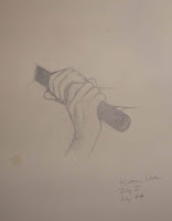
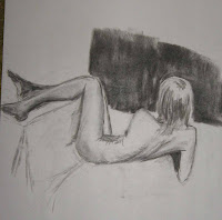
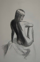
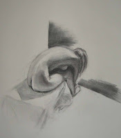
I had a drawing class again this past week and here are three images from the work I did. No live models, and half way through the class we trasisition into images with two models. I only have one drawing of the two I did because the instruction helped out on the 2nd one, and I prefer to post drawings that I have done mostly on my own.


Thats it for this week. Hope everyone is enjoying more spring like weather where you are, we are supposed to have a warm weekend, both good and bad as I have so much homework that I will need to stay mostly inside and working on it. But I do hope to get some outside time, maybe a walk at a different Audubon sanscuary. I do have a new FFFC challenge to do, but I won't be able to start it much less get it done. End of the school semester is coming up quickly and final projects are being announced so I need to focus on school work. As always comments are welcome.

Friday, April 17, 2009

Mid April & Patriots Day

Hi all, updates will be brief this week as we had Tuesday off as a school scheduling day. I am still not enrolled for a degree so didn't have to attend. But with no classes for me on Tuesday that means I have no new drawings this week.

I did have two Typography classes and two Graphic Design classes. In Typography we are working on Title setup and spacing. Not really something that I think my readers would find all that interesting so I won't bore you with images. Just let me say it isn't as easy as you might think, all sorts of things to keep in mind and so many decisions to make. I know your thinking that there can't be that many, oh but there are, just deciding on a Font to use can be mind boggling when you consider how many fonts there are out there. Then there is how to break it apart, where to put the text on the page, alignment etc. Lots of decisions, I think I will never look at a book cover the same way again.

In Graphic Design we turned in our 4th assignment. Using a word from nature and depicting the word typographically. We had to include the definition in the image and used Illustrator to get different effects with the letters. We could not warp or stretch a letter shape and we could not use color. However we could use different fonts, italic, bold, outline only, and even break the letter apart and remove some of it. Below are the two versions that I passed in. I think I like the black V volcano one better but who knows. My one comment here is that the layout of the letters is my instructors not mine. I did choose the type faces and how to treat each letter, but because he gave me the pattern of where to place the letters I sort of feel that I don't own this piece, if you can follow my thinking.

Outline on the left of the V is actually the definition of a volcano, text on a path if you are interested in the technical details.


Volcano #2 with the black V

I probably should have moved the definition to the first O, or perhaps the L, but I sort of like it on the V so I left it. I did have to move the path a bit away from the letter so it would remain readable. Most of my classmates preferred this one out of the two.

Because Color and Design meets 2 days a week I did have a class yesterday. Homework for that one was to create a drawing in the cubist style. We drew 3 views of the same item last week and then made copies. We then cut the copies up and arranged them so that the image looked like all 3 views of the bottle at the same time, sort of. Below is a photo of one of my original drawings of my bottle.


Straight on view of my bottle, I did 2 more
one side view and one top down view


Here is the final drawing

I cheated a bit and used chalk instead of charcoal, using white, black and gray chalks on the grayish paper. But the instructor liked it (I think), I didn't go overboard with the white so it does blend with the black and doesn't scream at the viewer. Cubist style is tricky, it matters very much the item you are trying to modify. My bottle works (I think) but some of the items the other students used didn't work very well and it showed in the results. The other two drawings that really worked was one of a shoe and another of a teapot, both very nicely done.

That's it. I haven't been sewing except for a bit of hand sewing so there is nothing on that front to show. Should have more for you next week since I will have a drawing class. Though Monday is Patriots Day here in MA so we have Monday off. It is also the day for the running of the Boston Marathon if you are into things like that. I expect I will be at home and working hard on homework. Everyone have a good weekend.

Friday, April 10, 2009

April Flowers/Showers

This past week I starting to see a lot more early spring flowers blooming, crocus, daffodils, Andromeda. Even the some of the forsythia bushes are showing yellow buds. YEAH. Course we also got rain, it really poured Monday afternoon/evening, but I know we need the rain so I guess I can't object. More rain is due for this evening and tomorrow, but Sunday Easter is supposed to be nice.

I had a major car problem this past week and missed both of my Tuesday classes. The car is now fixed, and I am much poorer (sigh), such is the way of cars, some days I wish I didn't have one, life is in a way simpler without them, it is certainly less expensive. Even though I missed my Tuesday drawing class I was able to attend the Thursday session so I do have drawings for you, but I don't have any homework images since I wasn't able to pick up my homework from last week. Simply means that I will have more homework images for you not next week, but the following week. Next week I have no Tuesday classes as it is scheduling day for the fall term.

In Color and Design I did finish my pen and ink final perspective drawing. We had to use all three of the classic methods of drawing perspective. Our professor calls it the Dam as we had to include a dam in the image, other required elements were trees going off into the distance, and telephone poles besides structures in one, two and 3 point perspective. This was a total pia to do, but in a way fun. So here is my version, just hope he likes it. I had to turn it in a day late as I missed the Tuesday class getting the car into the shop. He wanted us to use some ink wash and other details to add interest.


Sorry that the picture isn't the best, but it was cloudy that morning so I put the picture under a lamp and then had a hard time getting a straight down angle for the camera.

In Typography we are working on a couple of things, how to set up Book Titles and our research paper. Neither of which make very good images for the blog. Typography is so much how to set up a page so that it reads well, that I am not sure I will have many more images for you from this course this term. I will have to do a handout with the presentation of my research project but otherwise I think it is mainly computer design work, which doesn't really translate well.

In Graphic Design I am working on my final design for my Word assignment. We were in the Computer Lab with it on Wednesday and I now know what I need to do to get my final result which is due on Monday. I should have a picture for you of that one next week.

I attended yesterday's drawing class because I missed my Tuesday session, so I do have some figure drawings for you. We had another live model, she is a bit older then some of our others but still quite slender and gave us some really tricky poses. First images for you are from my warm up sketches, then a couple of longer studies. That said by the time we got to the last two poses I think I was running out of steam and didn't do such a good job, so you aren't seeing those. I changed my location in class so these drawings have different angles from those I have been doing.


I fear I didn't do a very good job on the foot that is on the bottom in this pose, but maybe if I tell you it is a foot you will see it. She was sitting on both legs, and the lower foot is a bottom of the foot view. Feet are tricky at any time, but bottom of the feet esp so.


First of our longer poses, I am not sure how I feel about this one, backs are a bit tricky and she had the shoulder in a slightly strange position. I was pleased when I just finished it, but now I am not so sure it works.


I rather like this one, even though I didn't really finish her left foot


Last image for this week.
I think I should have cropped it a bit more on the right, but otherwise I am relatively pleased with it.

Easter is this coming weekend for most Christians, and Passover started last night so I want to take this time to extend my best wishes for these celebrations to those who celebrate. Hope everyone has enjoyable holiday gatherings with friends and family.


Friday, April 3, 2009

April Fools?

OK I know I am not posting this on April 1st, in fact it is April 3rd. Hard to believe that it is already April, but I do know that I am ready for this winter to be over. School is keeping me very busy with homework, and I have a fair number of pictures for you this week. It is keeping me so busy in fact that I haven't had any time to work on my FFFC challenge. Well I have started a drawing in Illustrator, which would probably be done faster if I used pencil and paper, but I need to improve my Illustrator skills so I think I will continue to do it that way.

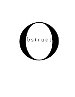
Where to start, well, I think I will start with Typography. Just an example of the word play we have been doing this past week. The idea was to choose a word then after reading the definition come up with a way to show the word and its meaning using just manipulation of letter forms. My best word is Obstruct, which I have an image of for you, but another that I liked was using the word arrow, making the letters form an arrow.


I now have to use this image as part of a headline. I think I have one, but suggestions are welcome at this point.

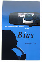
In Graphic Design I finished my poster project and turned it in on Wednesday. My Word was bias, and I chose to picture a traffic stop, view is from the inside of the car, with the police coming up to the car in the rear view mirror. I am showing you the blue background piece, though I also did one with white background. I had some issues getting the white background white (I had used a red gradient previously and getting the red out was interesting to say the least) But I did finally get it. Still my fellow classmates preferred the blue, and I think I do also. The poster was finished in Photoshop, the rear view mirror and its images were also done in Photoshop. The silhouette of the driver was done in Illustrator. I am fairly pleased with how the silhouette came out. The colored version of the driver is not so good, I need to work on hair and skin tones among other things,


Our next project in Graphic Design is to take a word and manipulate the letters in the word to create a visual image of the meaning of the word, but the word we choose has to be an object or event of nature. I am choosing the word volcano. This is similar to what we are doing in Typography but not quite the same as we can use different fonts and color. Still we cannot change the letter forms themselves so this should be interesting

In Color and Design we are doing more perspective work. The next two images are from my 2 point perspective studies. As homework this weekend I have a large picture to do using all three methods of determining perspective, one point, two point and 3 point, (which is a bit weird but works for certain views, like true birds eye or a worms eye view). I almost have it drawn out and hope to finish that today and start the inking.

Two point perspective is done using 2 vanishing points. The drawings we did had to have the same frontal vertical lines so that you can see what a change in horizon does to the view. The one with the middle horizon line was done first then the 2nd is with the horizon line moved up.


I want to use 2 point perspective to create my design for my FFFC challenge for March, not as complex as what you see here, but it should be fun.

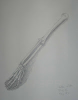
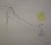
We didn't have a life model in drawing this week so we were doing longer studies from photo's. I some ways I prefer to work from photo's, the live models can move even during a pose which can make it tricky to get them down on paper. First though I have my homework from 2 weeks ago. We did arm and hand studies, and one of just the bones.


Only 3 images for you today from the Drawing class, as I said we were doing longer studies and only did about 5 or 6 instead of the 20 or more quick studies we do when we have a live model.


These last 2 were done on better paper, and are possible keepers. Oh yes she is that skinny. As you can see we are starting to add more of the area around her to give the bodies a setting.

That's it for this week. We are expecting heavy rain for this afternoon, so I will most likely stay home and work on homework, or even read a bit, or work on my pattern for the FFFC challenge.
As always comments are welcome.