Where to start, well, I think I will start with Typography. Just an example of the word play we have been doing this past week. The idea was to choose a word then after reading the definition come up with a way to show the word and its meaning using just manipulation of letter forms. My best word is Obstruct, which I have an image of for you, but another that I liked was using the word arrow, making the letters form an arrow.
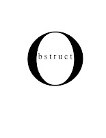
I now have to use this image as part of a headline. I think I have one, but suggestions are welcome at this point.
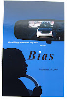
In Graphic Design I finished my poster project and turned it in on Wednesday. My Word was bias, and I chose to picture a traffic stop, view is from the inside of the car, with the police coming up to the car in the rear view mirror. I am showing you the blue background piece, though I also did one with white background. I had some issues getting the white background white (I had used a red gradient previously and getting the red out was interesting to say the least) But I did finally get it. Still my fellow classmates preferred the blue, and I think I do also. The poster was finished in Photoshop, the rear view mirror and its images were also done in Photoshop. The silhouette of the driver was done in Illustrator. I am fairly pleased with how the silhouette came out. The colored version of the driver is not so good, I need to work on hair and skin tones among other things,
In Graphic Design I finished my poster project and turned it in on Wednesday. My Word was bias, and I chose to picture a traffic stop, view is from the inside of the car, with the police coming up to the car in the rear view mirror. I am showing you the blue background piece, though I also did one with white background. I had some issues getting the white background white (I had used a red gradient previously and getting the red out was interesting to say the least) But I did finally get it. Still my fellow classmates preferred the blue, and I think I do also. The poster was finished in Photoshop, the rear view mirror and its images were also done in Photoshop. The silhouette of the driver was done in Illustrator. I am fairly pleased with how the silhouette came out. The colored version of the driver is not so good, I need to work on hair and skin tones among other things,
Our next project in Graphic Design is to take a word and manipulate the letters in the word to create a visual image of the meaning of the word, but the word we choose has to be an object or event of nature. I am choosing the word volcano. This is similar to what we are doing in Typography but not quite the same as we can use different fonts and color. Still we cannot change the letter forms themselves so this should be interesting
In Color and Design we are doing more perspective work. The next two images are from my 2 point perspective studies. As homework this weekend I have a large picture to do using all three methods of determining perspective, one point, two point and 3 point, (which is a bit weird but works for certain views, like true birds eye or a worms eye view). I almost have it drawn out and hope to finish that today and start the inking.
Two point perspective is done using 2 vanishing points. The drawings we did had to have the same frontal vertical lines so that you can see what a change in horizon does to the view. The one with the middle horizon line was done first then the 2nd is with the horizon line moved up.
I want to use 2 point perspective to create my design for my FFFC challenge for March, not as complex as what you see here, but it should be fun.
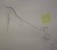
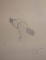
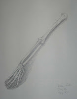
We didn't have a life model in drawing this week so we were doing longer studies from photo's. I some ways I prefer to work from photo's, the live models can move even during a pose which can make it tricky to get them down on paper. First though I have my homework from 2 weeks ago. We did arm and hand studies, and one of just the bones.
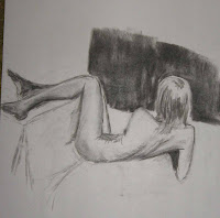
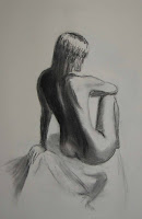
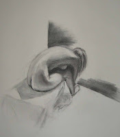
These last 2 were done on better paper, and are possible keepers. Oh yes she is that skinny. As you can see we are starting to add more of the area around her to give the bodies a setting.
That's it for this week. We are expecting heavy rain for this afternoon, so I will most likely stay home and work on homework, or even read a bit, or work on my pattern for the FFFC challenge.
As always comments are welcome.
Two point perspective is done using 2 vanishing points. The drawings we did had to have the same frontal vertical lines so that you can see what a change in horizon does to the view. The one with the middle horizon line was done first then the 2nd is with the horizon line moved up.
I want to use 2 point perspective to create my design for my FFFC challenge for March, not as complex as what you see here, but it should be fun.
We didn't have a life model in drawing this week so we were doing longer studies from photo's. I some ways I prefer to work from photo's, the live models can move even during a pose which can make it tricky to get them down on paper. First though I have my homework from 2 weeks ago. We did arm and hand studies, and one of just the bones.


Only 3 images for you today from the Drawing class, as I said we were doing longer studies and only did about 5 or 6 instead of the 20 or more quick studies we do when we have a live model.


These last 2 were done on better paper, and are possible keepers. Oh yes she is that skinny. As you can see we are starting to add more of the area around her to give the bodies a setting.
That's it for this week. We are expecting heavy rain for this afternoon, so I will most likely stay home and work on homework, or even read a bit, or work on my pattern for the FFFC challenge.
As always comments are welcome.


No comments:
Post a Comment