
This months theme for the Sketchbook Challenge blog is Warm - Cool using analogous colors. First I want to say that I have no trouble picking analogous colors (they are the colors that sit next to each other on the standard color wheel). I have painted color wheels and know the 12 standard colors used by heart.
But I find analogous colors boring unless you use more colors than one probably should. Usually when picking analogous colors you select just three, red, red orange, orange for example. For above sample I have more like 7 starting with red and ending with green.
So I started with three, starting with red and added through yellow, semi OK as those are all "warm" colors, but I just wasn't happy when it came to the actual painting. It just wasn't working. So I thought I would slip a bit and added a yellow green, still not enough oomph so I slipped some more and added a darker green, oops as that pushes the color range into the "cool" (green, blue, violet) side of the wheel. I seem to be able to manage the cool pallet, see the ATC (Artist Trading Card) below, but have a hard time just using the warm (red violet - yellow) colors by themselves.
I may try again to create a warm drawing with just colored pencils, but think that I will probably still not be happy with this color pallet. I much prefer using triads or split complementary colors, they add more zing and visual interest to my way of thinking. Reds just pop more when you add green (its complement) to the mix.
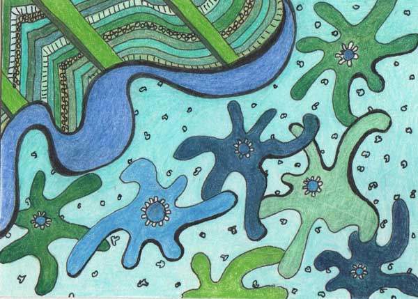
Above is the ATC I made using cool analogous colors. Am I happy with it, no, in fact I don't really like it at all. I am not pleased with the shapes I used or the overall look of the piece. The colors go together, and I tried to used as many as I had on hand in the same color families (green, blue green, blue) but still this just lacks spark. I suppose it was an interesting exercise but that is about it.

The above is just a doodle I made in the sketchbook but I had fun playing with it. I did the pen work first then added some color with colored pencil. Colors don't really fall into any formal selection, red-orange, yellow and green, but I think they work together anyway, maybe because there is lots of white. Anyway life would be boring if colors could only be put together based on the classic color groupings. Don't get me wrong those groupings work, mostly, but really, should they be the only way colors are selected? Nature certainly doesn't pull out a color wheel when flowers are growing wild in a meadow.
Back to the design I don't think it would work as a wall paper, too busy, but it might be a fun fabric, esp. if the white background was a more neutral beige, or perhaps a pale blue. I was just playing, but thought you might like to see.

Above photograph was made a week or so ago. It is a light coating of new snow on top of a pile of old snow. I just thought the textures and shadows were interesting.
That is it for today, per usual comments are welcome.
No comments:
Post a Comment