Showing posts with label ATC. Show all posts

Tuesday, June 21, 2016

Back to Watercolor with Pen and Ink


Today's blog update is actually revisiting work I did in May (or earlier) but never got posted to the blog. What can I say, my bad. With the return of warmer weather I am spending a lot of time out and about with my camera. Photographing flowers, butterflies, Odes and anything else I see that will hold still long enough. Leaving me not a lot of time or energy for my art or the blog. That said I am trying to get back to doing daily sketches. These are just very quick drawings usually with pen but sometimes as in my last update graphite. The sketches will probably be the art I will be posting for most of the summer now that I have these pen and ink works posted.

The above is about postcard sized. On cold press watercolor paper I first laid down a wash. No real pre-planning with these, I just pick a couple of colors and then work it from there, no rules except I like to keep the colors fairly light so that the ink work will show up. Once the paper is dry I look at the resulting wash and try to think what would look good on it. For the above piece I decided that abstract/geometric would probably be best, so hauling out my compass I drew various sized circles in pencil then got to work inking.

I used my technical pens for this, mostly the 0, and the 00 tips  So here it is, not sure if I like it or not, it was certainly more work than I expected when I started it.


These next two are ATC's or Artists Trading Cards, so the size is 3.5 x 2.5 inches. For these I used hot press watercolor paper and kept the watercolor washes very simple just a couple of colors.

The above is based on some of my photos of Jack in the Pulpits. I love those flowers and have tried to use them in my art in the past, with mixed results. This card I like, course the pink might seem a bit strange but I am not going for total realism here so for me it works.


With the background colors I selected for this card, I though water so drew a couple of fish, again revisiting previous art work, though these aren't really copies of what I have done before, just similar. I textured the background to make the fish stand out. I thought about adding some texture to the fish bodies, but decided that if I did that then the fish would just blend into the background instead of standing out. I decided to do minimal ink work on the fish bodies. I am not sure about the water plants, I thought I wanted something to add a bit more interest, but after I had done it, I was kind of sorry.


This past week I spent a day in Boston, mostly so I could make photographs, but I also made a side trips to the Boston MFA and to the Public Library. While there I made this quick sketch of a fellow patron. His thumb is a bit out of wack, proportion wise, to the rest of him, but I am not totally displeased with how this came out. Done in my small sketch book with a Copic .2 Multiliner pen.  


It is surprisingly difficult to get a good photo of a waterlily. Mostly because they are usually in the middle (or at least not near the edge) of ponds, and I don't have a boat. The one in the above photo was actually next to a rock near to shore, so I was able to photograph over the rock for the above photo. I cranked up the ISO so that the shadows would show up. Finally a water lily photo I am pleased with.


This is a photo of Copley Square taken from the steps of the Boston Public Library. I can't recall the name of the church in the square but it is rather well known. What I find interesting in this photo is the John Hancock building with it's reflective glass windows. On the side facing the viewer you can see reflected clouds, making it a bit hard to actually make out the building. Fun effect and very Boston. Though when I first moved to Boston back in the 1970's the building was covered with plywood because the windows kept pooping out of their frames, took a bit of engineering and a law suit to resolve the problems. But resolve them they did, I haven't heard of any glass falling for years.

That is it for today, per usual comments are welcome.


Monday, June 9, 2014

An ATC, Watercolor and pen and ink Drawing


If this looks familiar it is because this ATC (Artist Training Card) is based on an image I posted a few weeks back. The bee started out as a doodle and then just evolved. For the card I changed a few things while leaving it basically the same. I don't do whimsy often so like to take advantage of it when I do.

Done on Stonehenge paper, pen and ink with colored pencil added.


Over the weekend I thought I would try to make another plein air painting. I needed to return a book to the library so after that stop I traveled on to a local park and made the above. I sketched it first with pencil added a few ink lines, erased the pencil and then painted it with watercolor.

Hmm, well I suppose not the worst painting I have ever done (that had to be a watercolor I did back 40 years or so ago) but it certainly isn't the best either. Very muddled, design wise, and my greens are not the best, even for a sunny day in June. Though it is probably hard to tell there is a granite sculpture toward the right of this painting that was supposed to have been the focal point.  Somehow the trees sort of took over. I can see working plein air is going to take a lot of practice before I even start to get this right.

The painting is small  5.5 x 7 inches but even so I am finding that the brush that came with my Cotman watercolor travel kit is just too small. I am going to have to figure out a way to carry a larger, better brush with me without damaging it. I suppose there are other brushes that I could purchase but that isn't something I want to do at the moment. I will figure something out, just have to think about it a bit.


A quick pen and ink sketch, well quick only in the sense that it didn't take me long to do the inking, or even to do the preliminary sketching with graphite. But the concept behind this drawing has been kicking around in my brain and even occasionally as attempted sketches in my sketch pad for years.

When I was a kid I had a fish tank that sat on top of a book shelf, I also had a cat, well the family had a cat, Taffy was never really mine. Anyway it was Taffy's habit to jump to the top of the fish tank and attempt to catch a fish. I don't believe he ever caught one but he sure tried hard enough.

All my previous attempts to draw this action just weren't working, I was trying to be much too realistic with the cat. Not sure this is my final version but I am liking this one much more than any I have done before. I have a lot of "Taffy" stories and have been wanting to make illustrations for some of them for a long time, maybe I now have a start. Wish me luck.

Done in my sketchbook, graphite first then added pen and ink using my technical pens.


As my photograph for today above are a couple of Dogwood flowers. These aren't the same species of Dogwood as the earlier pink flowers, those trees bloom prior to leafing and the ones in the above photograph are just in bloom now (in early June). There are quite a few varieties of dogwoods either native to North American or to Asia.

Our early spring bloomers (think pink) are native to North America, the tree blooming above is Japanese. Whichever, the flowers are actually the green center and the white or colored "leaves" are called bracts.  Our native tress prefer some shade while the Japanese variety can deal with full sun.

That is it for today, per usual comments are welcome.

Monday, May 12, 2014

New ATC, pen and ink, and flower


I finally finished it, my watercolor ATC (Artist Trading Card) version of the rocking horse I drew a couple of weeks ago. Design is based on various antique rocking horses and influenced by my memories of the horse I had as a child.

I loved that horse, and for a long time (well it seemed a long time) I rode weekly with Roy Rogers as he and Dale vanquished the bad guys. I can't recall what name I gave it. It was a palomino like Trigger and probably my favorite plaything. Eventually I got to big and to old to ride and it was put away but I remember it fondly.

Course mine wasn't a real rocking horse, its body was probably fiberglass, and instead of rockers it had springs that allowed the horse to rock, back and fourth on its wooden base.

The ATC is pen and ink with watercolor on Fabriano 140lb cold press watercolor paper.


Haven't been doing any pen and ink work lately, not quite sure why, just haven't felt like it I guess. But I decided I had better get my act together or I won't have done any of the WetCanvas Pen and Ink forums May challenge images.

So above is a barn, a bit of a strange barn with the hole in the middle, but the photograph calls it a barn so I guess it is. Not sure why someone would design a barn this way but I am sure they had their reasons.

I drew it out in graphite first then added ink using various sized technical pens, drawn in my sketchbook so paper wasn't of the best.


Another colored pencil/pen and ink flower drawing, done from a live plant, this is I think either Dames Rocket or an escaped close garden relative. The leaves aren't quite right for a Dames Rocket, but the flower colors, shapes and growth habits are so I guess I will leave the identification as is unless someone wants to tell me otherwise.

The plant was growing wild in an empty lot so I felt no guilt picking it and bringing it home to draw.


The photograph for today is the same tree I showed in my last update, but this time the redbuds are in bloom. Not too far away were a couple of white redbuds, but I think this pink is more visually interesting. I love spring, hopefully for my next update I will have a pink dogwood photograph. 

That is it for today. Per usual comments are welcome. 


Sunday, March 9, 2014

Analogous Colors in Use, mostly


This months theme for the Sketchbook Challenge blog is Warm - Cool using analogous colors. First I want to say that I have no trouble picking analogous colors (they are the colors that sit next to each other on the standard color wheel). I have painted color wheels and know the 12 standard colors used by heart.

But I find analogous colors boring unless you use more colors than one probably should. Usually when picking analogous colors you select just three, red, red orange, orange for example. For above sample I have more like 7 starting with red and ending with green.

So I started with three, starting with red and added through yellow, semi OK as those are all "warm" colors, but I just wasn't happy when it came to the actual painting. It just wasn't working. So I thought I would slip a bit and added a yellow green, still not enough oomph so I slipped some more and added a darker green, oops as that pushes the color range into the "cool" (green, blue, violet) side of the wheel.  I seem to be able to manage the cool pallet, see the ATC (Artist Trading Card) below, but have a hard time just using the warm (red violet - yellow) colors by themselves.

I may try again to create a warm drawing with just colored pencils, but think that I will probably still not be happy with this color pallet. I much prefer using triads or split complementary colors, they add more zing and visual interest to my way of thinking. Reds just pop more when you add green (its complement) to the mix.


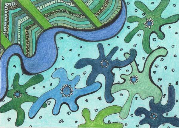
Above is the ATC I made using cool analogous colors. Am I happy with it, no, in fact I don't really like it at all. I am not pleased with the shapes I used or the overall look of the piece. The colors go together, and I tried to used as many as I had on hand in the same color families (green, blue green, blue) but still this just lacks spark. I suppose it was an interesting exercise but that is about it.


The above is just a doodle I made in the sketchbook but I had fun playing with it. I did the pen work first then added some color with colored pencil. Colors don't really fall into any formal selection, red-orange, yellow and green, but I think they work together anyway, maybe because there is lots of white. Anyway life would be boring if colors could only be put together based on the classic color groupings. Don't get me wrong those groupings work, mostly, but really, should they be the only way colors are selected? Nature certainly doesn't pull out a color wheel when flowers are growing wild in a meadow.

Back to the design I don't think it would work as a wall paper, too busy, but it might be a fun fabric, esp. if the white background was a more neutral beige, or perhaps a pale blue. I was just playing, but thought you might like to see.


Above photograph was made a week or so ago. It is a light coating of new snow on top of a pile of old snow. I just thought the textures and shadows were interesting.

That is it for today, per usual comments are welcome.

Saturday, February 22, 2014

Another ATC and Chipmunk finished


Again I have a slightly misleading image as my first one today. This is another ATC (Artist Trading Card) so the image on your screen is probably larger than the actual card. ATC's are 2.5 x 3.5 inches in size. This one was done on Canson's 140lb Watercolor paper cut to size.

This is from another of the WetCanvas pen and ink monthly challenge reference photographs. I did this first as a pen and ink drawing, but I really love the colors so decided that it would be fun to make an ATC painting of it. Combination of watercolor pencils and pan watercolors, though I did sketch it out in graphite and then outlined the basic elements with pen and ink prior to painting.


This drawing is really 8 x 7 inches, so in reality much larger than the ATC. Not sure if it is totally done, but I think so, at this point any changes are going to be subtle. I spent several hours yesterday, looking and making slight changes until I felt I  had done all I could/should. Work at that point was mostly adjusting values in some of the shadow areas.

I use a ruby beholder to check values in my drawing against the reference photograph. It is a technique used by quilters to check fabric values as the red nullifies all other colors and all you see is value. I find it a useful tool when making my animal drawings. It is way too easy to think you have graphite in the drawing the same value as the reference, but really don't, only the relationships are correct, but darkest dark needs to be still darker.

The drawing which I am calling On The Fence, is from a photograph I made last summer at the Trailside Museum in Milton MA. People were feeding the ducks and the resident chipmunk population had arrived to get their share. This little guy posed on the lowest fence rail long enough for me to snap its photograph.

Done entirely with graphite, various hardness starting with a 7H and working up to a 2B, but most was done with the 2H, HB and B grades. Base is Stonehenge paper. This is a redraw though the first time I drew him it was a fairly quick drawing in one of my sketchbooks.


Between the watercolor ATC and the chipmunk drawing I haven't had a lot of time to work on other projects, but I did spend part of an evening doodling in my sketchbook, thought you might like to see the kind of things I doodle. Mostly plants/flowers but there is one snail in there, not sure where he came from. Sometimes these doodles become a larger project, so I don't feel that I am wasting my time doing them.


I made this photograph the other day out of one of my windows. For some reason a bit of snow had stayed on the railing and created this icicle. I made several photographs of it, but find I like this one with sunlight on it the best. Needless to say it is long gone. We have been in a warming trend for the past several days, (well at least during the day) and have had at least an inch of rain so the icicle is history.

That is it for today, per usual comments are welcome.

Tuesday, February 18, 2014

Gourds, more gourds and a flower


Back a couple of weeks ago I made a pen and ink sketch of 3 gourds from various reference photographs. That drawing reminded me how fun it can be to draw gourds and their odd shapes and bright colors. So I visited the WetCanvas photo reference library and downloaded several more photographs of gourds. Using one of those references I created the above colored pencil drawing.

I first drew the gourds in pencil, then outlined them in ink and finally added color using multiple brands of colored pencils. I didn't spend a huge amount of time on it. I am still working on my Chipmunk drawing, so am saving time spent working in detail for that. Still I am not displeased with how this came out. The bowl is a bit wonky but I think I managed to give some feeling of depth and roundness to both it and some of the gourds. Drawing was done in my sketchbook.


While I was drawing the gourds in the bowl I thought it might be fun to make a bookmark using various gourd shapes so drew the above image. The three gourds were taken from different reference images so their position is my composition.

Bookmarks can be tricky to design as the are long and narrow, and I find I prefer the image to be vertical, after all that is how the bookmark will be viewed when in use. Gourds which can be long and narrow seem to be a perfect subject.

Done first with pen and ink I then added colored pencil to the image. Of course it still needs a bit of work before it is a finished bookmark, but so far I rather like it. To be honest I like this one better than the last couple I drew with the heart motif.


The above image is slightly misleading as this is actually a small watercolor ATC (Artist Trading Card). Pretty simple, and fairly quick to draw and paint. I used my watercolor pencils for color on this one, just applying enough water to active the color.

I am currently reading a book on Watercolor painting, Painting in Watercolor by Kate Gwynn. It is part of the Artists Handbook series and was published in 1982 so it is old. Still watercolor techniques and methods haven't changed much from then to now. I think there are now more watercolor pencils than there were back then, but otherwise paints, papers and brushes are pretty much the same. Book is from the library, and the only one I saw on that particular visit.

I have also been spending a lot of time in the WetCanvas watercolor forums, reading threads that have to do with selecting colors for a pallet, various papers to use, and other technical aspects of watercolor painting. The end result is I have watercolor painting a bit on the brain, didn't feel like working on the other piece I have in the works so did this little guy.

It is in a way killing two birds with one stone as the Sketchbook Challenge blog theme for February is Windows. So here is a little watercolor of a plant sitting in a window. loosely based on one of my cyclamens (I have 2, one red, one pink) that are sitting in my northern exposure bedroom window.

I am thinking about painting some more Watercolor ATC's, they are small so quick to paint, but also allow some practice with watercolor.


I made this photograph last week prior to our latest snow storm, and on a day when we had some sun. These are just grasses in an open lot, but I rather like the color/value contrasts, with the browns of the grasses against the white of the snow and then there are the shadows, a cool/warm color pallet if I ever saw one.

That is it for today, per usual comments are welcome.

Monday, January 13, 2014

ATC and 3 Variations on a Still Life


Above is an ACEO or ATC (Artist Trading Card) that I just finished. I was just playing around with one of my technical pens and drew those sort of pine tree looking trees, added some lines for what could be bushes or shrubs and others for what could be green areas on distant hills. Pulled out my green colored pencils and colored in the trees, shrubs and other green areas, then added some grey to suggest rocks, and clouds against a blue sky. Well the clouds could use some work. I mostly avoid drawing or coloring clouds in my landscapes and I feel it shows.

Still I rather like the results, looks better life size instead of blown up on the screen.


The other day I was having a snack on one of two golden delicious apples I had on hand and decided it might be a good idea before I ate the pieces to set up a still life and draw it. First go round I used one of my technical pens creating primarily outlines with just a bit of shading.


Next I hauled out one of my graphite pencils and sketched the apple and pieces on the plate. Did OK with most of it except the rear right corner of the plate, that doesn't work for me. Course by the time I had the sketch semi laid out I was starting to get a bit impatient with it, I was hungry and wanted to just be done with the drawing so I could eat my apple.

There is definitely a downside to drawing eatable objects, esp. if they were intended for a snack prior to the drawing session.


When I was scanning my drawings into the computer for this blog update I got the idea to add some color to the line drawing of the apples. Since I scan into Photoshop the image was right there and it didn't take too long to add some color and some additional lines. It was a fun exercise, quick and easy to do. I think I spent more time selecting colors than filling in the areas.


With our rather strange weather I haven't been out to any of the parks recently. First the snow kept me in, then the cold and then when it finally warmed up we had several days of clouds and rain. Today I finally managed to get out for a bit to run an errand I photographed this street of houses and roofs. I have found this particular street interesting for quite a while because of the roof lines.

This afternoon the sun was starting to get a bit low in the western sky. It lit up the houses and roofs but left the street in shadow.  Someday if I get back to working on Art Quilts I want to make a quilt out of this scene. 

That is it for today. Per usual comments are welcome. 

Saturday, December 14, 2013

New ATC, another flower drawing and photographs


Just a short blog update today. Above is a new Artist Trading Card (ATC). I used the same background pattern for this as I used for one of my latest bookmarks. This background came out a bit better than the bookmark. ATC's are a bit wider than the bookmarks and I was a bit more aware of the pitfalls of drawing a basket weave pattern as a background.

This card seems to be saying more spring than Christmas or winter to me, but these were the colors I was in the mood to use. Since we are supposed to be getting at least a few inches of snow I suppose it is just wishful thinking on my part. Media is pen and ink with added colored pencil.


I have several arrangements of artificial flowers around the apt. The drawing above is one of the first I put together. It sits on the table in the kitchen/dining space which happens to get a lot of sun, so the purple flowers are getting a bit faded. I suppose it is time to get rid of them and either get something else or just let the vase be empty. Colored pencil with ink laid in on top. The actual arrangement is fuller, but somehow I think I missed that feeling in the drawing. Guess I will just have to try again another day.


A couple of photographs to end this short update, above is one of the flowers on my White Christmas Cactus. Love that touch of pink at the heart of the flower.


My miniature cyclamen is blooming. Love the intense red of these flowers. I thought I would capture the look now as when I get back from Christmas the plant will probably look a bit sad. I will bag this so it will survive, but it doesn't like being bagged so is a bit droopy for months afterword.

That it is for today, have been busy trying to get ready for Christmas so not doing a lot of drawing. In the meantime comments are always welcome.

Monday, December 2, 2013

Sketches, a new ATC and some DrawingTools


Above is a new Artist Trading Card (ATC) that I finished over the weekend. It didn't come out quite the way I was envisioning it when I started, which I suppose means that I need to make another one that may be more in line with my concept, except at this point I am not sure what the original concept was. I hope I am not the only person who looses track of the original concept once they start working. Sometimes that is a good thing, but with this card I am not so sure.


Thanksgiving day I spent with friends and while listening to the chatter I spent some time sketching, these two drawings are a result. Hmm, all I can say is that I think I need to spend a lot more time drawing from life. I am not totally thrilled with either the basket or the cup. Though the cup drawing is a bit better than the basket.


Above is a cup of tea with a teaspoon in it. Course the cup did have a design on it, but there was no way I was going to attempt that.


My friends family includes several fairly young children, and of course they were interested in my drawings and supplies. Since I use some tools that aren't familiar to them there were quite a few questions. It occurred to me that I might include some of the information I shared with them here on the blog. So the above image is some of my standard drawing tools. On the left a kneaded eraser, bottom middle is a clutch pencil holder, above that is the 2 mm "lead" that fits the holder, and on the right is a pink pearl eraser.

Because of cost and ease of  "sharpening" I prefer to use clutch pencils with 2mm leads. Course the tool used for pointing the leads can get a bit messy to haul around so I keep one in a plastic bag, but I don't think it is quite as messy as a regular pencil sharpener. I also use kneaded erasers which most of the kids had never seen before. One young boy wanted to insist that it was a piece of clay since that was what he was familiar with. The kneaded eraser is used to lift a bit of graphite when things have gotten a bit too dark. I also like Pink Pearl erasers, but those are fairly common so no comment was made about those.

For the clutch pencils I have several different hardness, B, 2B, 3B, 4B, 2H, 3H, and 4H, each in its own holder. I prefer the Staedtler Mars carbon  leads as they seem to be the best quality. For the really soft grades (above 4B) I use regular wooden pencils. The softer the graphite the darker the line you can get, a 2H is more grey than black, though graphite is never truly black but only a dark grey. For best lifting with a kneaded eraser I find that it needs to be warm so I tend to hold it in my opposite hand when I am doing work where I will be using it.


Saturday was a beautiful though chilly sunny day with a few clouds. I drove up to the Blue Hills Reservation and walked around Houghton's Pond. Above is a photo of the pond that I made that day. I find it interesting that clouds in photographs at this time of year even in early afternoon have some pink/lavender color to them.

The pond looks so still and calm reflecting the trees, clouds and sky. There were some ducks on the pond, but since I hadn't brought my field glasses I am not sure of the species, all I know is they weren't mallards as some of them were diving under the water and mallards don't dive. As you can see there were no beach goers there that day.

That is it for today, per usual comments are welcome.

Tuesday, October 29, 2013

An ATC and Bookmark with more Figures


Managed to draw a new ATC (Artist Trading Card) over the weekend. I started out playing with some shapes and it just developed from there. Color is colored pencil and I am really pleased with the result. Doesn't look very fall but then that wasn't really my goal.

I am using a new to me paper, Canson's Comic and Manga 150 lb paper. It is heavy weight with a smooth surface that takes pen well. There seems to be enough tooth to take colored pencil, though not as well as Stonehenge does. Anyway I have more ATC blanks of this paper waiting for me to use so by the time I have finished them I should know how I like this paper and what media I prefer using.


Also finished the above bookmark this weekend. I started this one several weeks ago but put it aside to work on some other ones. Still I kind of like the flower shapes so decided I should get to it and finish it off. It isn't totally done of course, just the art work is finished. Still have to add the contact paper layer and then the tassel. More colored pencil and ink work on this one.


Above are more of my short pose figure drawings. These are from a session a couple of weeks ago. A couple I rather like, the others hmm, well.... just have to keep at it is all I can say. Top grouping are 2 minute posed, bottom grouping are mainly 5 minute poses with one 10 minute pose.


As a close a couple of photographs I made yesterday. The trees around me are starting to get pretty bare of leaves but there are still a few with color. Above is one near the entrance to my local park.


These leaves were actually on a bush not a tree, but I love the color and thought you might also enjoy seeing it.

That is it for today, per usual comments are appreciated. Though I have to say that I am having problems getting the blog to allow me to reply to comments, so it isn't that I haven't read and enjoyed everyone's comments on previous posts it is that the software isn't allowing me to reply. Thanks to everyone who has taken the time to comment, I really do appreciate it.

Monday, February 18, 2013

Presidents Day Update


Today's update includes a couple of ATC (Artist Trading Cards) that I have been working on. Sometimes I seem to come up with a design that won't go away until I explore several iterations. The flower design I came up with a couple of weeks ago is one of those. Both of these cards use the design, the top one with the flowers mostly the same size just moving across the card. For the lower image I simplified some of the flowers and varied sizes quite a bit. I rather think I prefer the 2nd card to the first, but that is me, and I have a feeling there are others who might prefer the top card. Whichever doesn't matter to me.

Both cards were done on Stonehenge paper with inked outlines and colored pencil fillers.


Not sure if I am done with this series or not, only time will tell. In the meantime if you want to tell me which one you prefer I would love to hear.


Since last Monday communities were still digging out from our major snowstorm I decided to not to to the Long Pose Drawing Session. Roads weren't in good shape and while the day had been warm meaning that melting had happened I was concerned about ice on the roads after Dark. Anyway by Tuesday things were a bit better so I went out to the Short Pose Session again. Our model was lovely and very good, striking many lovely poses. While I am not thrilled with a lot a drew that night I thought I would share 4 drawings that for one reason or another I rather like.

The above 2 drawings are pen drawings of 3 minute poses. I start out with a chalk type pencil to warm up and then move to pen for many of these very short poses.


When the poses move to 5 minutes I switch over to a soft lead pencil (4B). The 2 drawings above were both 5 minute poses. She also did a couple of 10 minute poses for us, but I think by then I was getting pretty tired and I am not totally happy with those drawings.


The above photograph is of a male mallard duck flying. The background looks blurred because I was moving the camera trying for a photograph of a non-blurred flying duck.

That is it for today, per usual comments are always appreciated.