Showing posts with label watercolor. Show all posts

Monday, May 21, 2018

Birds and flowers


Spring is advancing, we are getting some warm days and some cool wet days along with some that are just cloudy. Wet and/or cloudy days are not good for photography. I have managed to do a couple more watercolor paintings. Again I am drawing my main subject first with pencil then inking an outline that I then paint with watercolor. My drawing skills are a bit rusty and since I want to concentrate on controlling the paint/color and not shapes I am finding this the easiest way to work.

So the above tulip was drawn and then outlined prior to my adding paint. That said I am relatively pleased with how it came out. I am trying very hard to not overwork the paint, but it isn't always easy to just stop.


After the tulip I thought I would try a more challenging subject. So I drew an outline of a robin and then attempted to paint it. Hmm, well the shape of the bird isn't quite right (it is a bit too fat in the belly). and it was a challenge to leave the white areas (unpainted paper) but I think I got the colors almost right  Anyway it looks like a robin so I am semi happy and plan on trying more birds in the future.

The background above is only sketched in with paint. The robin was on the ground in the reference photo and I didn't want to try and paint tan dried grasses. Not a masterpiece but a learning experience that I am not unhappy with. 


It is not all watercolor work here. I have pulled out my colored pencils and gotten to work on pieces that I had started a cople of years ago and ended up putting aside for no particular reason other than I had gotten tired of working with colored pencil .

I just finished the one above, Bindweed and Birdfoot Trefoil flowers with a bit of fern. The scan isn't the best color wise but it is a fairly close approximation.

I am currently working on another flower drawing (day lilies) but have also been trying to select photos for the additional drawings, I want to do 13, enough to create a calendar. So far I have selected some additional flowers and some animals. Which reminds me that I really need to finish the squirrel. Just have to say that trees are hard to draw, which is what is holding that one up.


As a closure here are a couple of Spring photos. Above is a close up of some Red Bud flowers that I made earlier this month. Love the pink. 


The building above is my Public Library with a blooming Dogwood tree. The library actually has 2 Dogwoods in the front, but the 2nd (which is pink) is hidden by the maple tree on the right.

That is it for today, per usual comments are welcome.

Saturday, May 12, 2018

Playing with Watercolor


Since I am not driving all over the state in search of early butterflies I have been trying to get back to my art work. My main focus is improving my watercolor skills, with mixed results. For subjects I am going through my photo archive and selecting photos that I think will be relatively easy to paint, mostly flowers at this point.

Above is a columbine, I selected a photo of an individual flower and tried to paint it without any preliminary pencil or pen work. I am relatively pleased with how it came out. Native columbines are such a  pretty late spring flower and it was fun to try and paint the rather complex shapes.


My next attempt was the above image of 3 cosmos flowers. I have painted this subject before with as I recall not much more success, for some reason these are tricky flowers to paint.

Perhaps it is the color of the flowers, pink. There is no such thing as pink watercolor paint, there are various shades of red but no pink. So to get pink you have to add water, lots of water, which makes a wet paint that I find tricky to control. I am finding it hard to get the brush loaded just right. Paper towels are necessary, at least for me so that I can remove some of the moisture from the brush prior to painting. Still I think this attempt is better than my previous attempt, which isn't saying much. After a lot more paintings maybe I will try again.


I tried something a bit different with these daffodils. I drew the image first with pencil, then inked the outline lines and then added color. I started with a light yellow wash, removed some of the paint in some areas, then allowed the paper to dry. The next session I added some darker yellow and orange shading. Allowed that to dry and then added the shadows and the background. I am fairly happy with how this one came out. At least they look like daffodils. Again the reference was one of my personal photographs.

For all my paintings I am using a half sheet of Fabriano Studio Watercolor paper, the cold press, 140 lbs 9 x 12 inch sheets. It contains 25% cotton so isn't as expensive as 100% cotton paper but stands up better to water etc. than a 100% wood pulp paper or a lighter weight paper. 


These next two photos are both of "Violets", though the ones above are wild (and I think native) while the ones in the photo below are house plants that come from another continent. I don't think they are actually related but I may be wrong.


Anyway I usually have at least one African Violet plant that I keep in my bedroom (the windows face North which my African Violets seem to love). Right at the moment one of the plants is in bloom so I thought I would share a photo of them This plant flowers a kind of salmon pink, not my favorite color, I prefer a dark purple but I tend to purchase plants that are on the sale table so they usually don't have flowers when I buy them.


Earlier this week I took a trip into Boston, got off at Park and walked across the common and through the Garden. The flowering trees were putting on a show and the swan boats were out and about on the pond. Above is a photo of a swan boat at the boarding shed. It was a beautiful day, I ended up at the Library for lunch and then headed out to the smaller Blicks store for some spare colored pencils. Next update will have a colored pencil drawing. Something old that I have finally finished.

In the meantime that is it for today, comments are always welcome.


Tuesday, June 21, 2016

Back to Watercolor with Pen and Ink


Today's blog update is actually revisiting work I did in May (or earlier) but never got posted to the blog. What can I say, my bad. With the return of warmer weather I am spending a lot of time out and about with my camera. Photographing flowers, butterflies, Odes and anything else I see that will hold still long enough. Leaving me not a lot of time or energy for my art or the blog. That said I am trying to get back to doing daily sketches. These are just very quick drawings usually with pen but sometimes as in my last update graphite. The sketches will probably be the art I will be posting for most of the summer now that I have these pen and ink works posted.

The above is about postcard sized. On cold press watercolor paper I first laid down a wash. No real pre-planning with these, I just pick a couple of colors and then work it from there, no rules except I like to keep the colors fairly light so that the ink work will show up. Once the paper is dry I look at the resulting wash and try to think what would look good on it. For the above piece I decided that abstract/geometric would probably be best, so hauling out my compass I drew various sized circles in pencil then got to work inking.

I used my technical pens for this, mostly the 0, and the 00 tips  So here it is, not sure if I like it or not, it was certainly more work than I expected when I started it.


These next two are ATC's or Artists Trading Cards, so the size is 3.5 x 2.5 inches. For these I used hot press watercolor paper and kept the watercolor washes very simple just a couple of colors.

The above is based on some of my photos of Jack in the Pulpits. I love those flowers and have tried to use them in my art in the past, with mixed results. This card I like, course the pink might seem a bit strange but I am not going for total realism here so for me it works.


With the background colors I selected for this card, I though water so drew a couple of fish, again revisiting previous art work, though these aren't really copies of what I have done before, just similar. I textured the background to make the fish stand out. I thought about adding some texture to the fish bodies, but decided that if I did that then the fish would just blend into the background instead of standing out. I decided to do minimal ink work on the fish bodies. I am not sure about the water plants, I thought I wanted something to add a bit more interest, but after I had done it, I was kind of sorry.


This past week I spent a day in Boston, mostly so I could make photographs, but I also made a side trips to the Boston MFA and to the Public Library. While there I made this quick sketch of a fellow patron. His thumb is a bit out of wack, proportion wise, to the rest of him, but I am not totally displeased with how this came out. Done in my small sketch book with a Copic .2 Multiliner pen.  


It is surprisingly difficult to get a good photo of a waterlily. Mostly because they are usually in the middle (or at least not near the edge) of ponds, and I don't have a boat. The one in the above photo was actually next to a rock near to shore, so I was able to photograph over the rock for the above photo. I cranked up the ISO so that the shadows would show up. Finally a water lily photo I am pleased with.


This is a photo of Copley Square taken from the steps of the Boston Public Library. I can't recall the name of the church in the square but it is rather well known. What I find interesting in this photo is the John Hancock building with it's reflective glass windows. On the side facing the viewer you can see reflected clouds, making it a bit hard to actually make out the building. Fun effect and very Boston. Though when I first moved to Boston back in the 1970's the building was covered with plywood because the windows kept pooping out of their frames, took a bit of engineering and a law suit to resolve the problems. But resolve them they did, I haven't heard of any glass falling for years.

That is it for today, per usual comments are welcome.


Monday, May 30, 2016

Plein Air in State Parks, just graphite


Spring is well advanced here in MA., trees are mostly leafed out, flowers are blooming, some butterflies and Odes are flying and I have been doing a lot of walking and photographing in my "local" state parks and Sanctuaries. Course with the leaves come those pesky caterpillars for winter and gypsy moths. UGH, I hate walking through woods and hearing the poop and leaf bits dropping. Not much I can do about it, though I do kill every caterpillar that lands on me or that I see hanging by a thread. I know not much of a defense against the on-slot but I feel better doing it.

On some of my walks I will take a small break to rest my feet and knees, and have taken to doing some small graphite sketches while I do so. So today I am showing 3 of these. The top one is from Borderland State park, shows a tree, one of the ponds and more trees in the distance. Hmm, I think I need to work on some textures for the trees in the distance. And I am not sure I conveyed the water very well.


Above is another image from Borderland State Park. There is an old farm house on the property (actually there are 2, but one is off to the side and I only drive by it, I don't walk by it) any way they have put in a couple of small garden areas near the house, this is a sketch of some of the plants, the rocks that surround the plot, a field with distant trees. Still need to work on the distant trees, but I almost like the way I blocked these in better than what I did in the first sketch.


The park represented here was Massasoit State Park, East Taunton, MA. I was down there looking for Pink Lady Slippers, it is that time of year for them to be blooming. And yes I found my Lady Slippers. Near the entrance there is this "table" made of a flat rock piled on more rocks and a concrete block, that is what is supposed to be in the drawing, with a bulletin board in the background that has a map of the park along with a couple of notices. I didn't spend a lot of time on this, but not too bad.

I am hoping that by doing these graphite sketches I will work up the nerve to do some watercolor ones. But a huge part of a successful plein air painting is knowing what to put in and what to leave out, and learning to narrow ones focus. You can't paint everything you see after all, so with these drawings I am trying to learn how to narrow my focus. Wish me luck.


I recently achieved a goal with my watercolor paints, acquiring Artist quality pigments for all the colors I had in Student paints. Now I just need to learn what they can do and how to use them.

So to help with that I am mixing color swatches. Since yellow tends to be the lightest color I am starting with my 6 yellow/orange colors and using a selected 7th color mixing swatches. The 7th color is shown in the right column, at various strengths (dilutions with water). The pair of cards above shows the yellows with turquoise. I inadvertently purchased 2 different tubes of turquoise but they are from different manufactures and actually are different pigments so the resulting color is different even though they have the same name. I found working on these cards very interesting, first the greens I was mixing are more like what I see on my walks but 2nd was the difference between the two manufactures. Now to decide which goes in my travel pallet.

I have finished more of these and will be posting them in other blog updates.


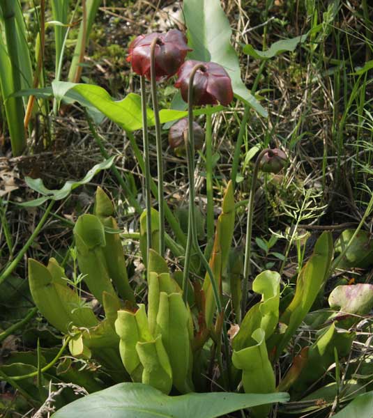
This spring I discovered that there were many more pitcher plants in Borderland State Park than I ever expected. I have been keeping an eye on them all spring and this week was rewarded by seeing them actually in bloom. Course the blooms face the water, and I don't have boots or a boat so can only photograph the back side. Still isn't this photo fun, with the new green pitchers (leaves) and the reddish blooms.


Another photograph from Borderland State Park. This year there has been a heavy I almost want to say infestation of Swollen Bladderwort, a pretty yellow flower on an aquatic plant. All of the yellow in the above photo is this plant in bloom. I don't recall ever seeing this before. Pretty but also a bit disturbing,there have to be thousands of plants to create this show.

That is it for today, per usual comments are welcome. As I write this it is Memorial Day in the US. It was initially started to remember and honor the solders who fought and died in the American Civil War, it has since become a day to remember all of our War dead. I am not sure their sacrifice was always given in a good cause, but we owe it to them to remember and honor it and them.


Saturday, May 21, 2016

More Ink over Watercolor, some Graphite Sketches


ACK, where has the time gone, I kept meaning to post an update to the blog, then I ended up too tired, or busy and it didn't get done. Sorry about that. Above is another of my watercolor washes with ink overlay. For this one I actually sat down and did some up-front design work instead of just winging it as I had been doing. Not sure it is much of an improvement, but at least I gave it a go.

Size is still small, about post card sized, on cold press watercolor paper, I used a dip pen with India Ink for the ink work.

The drawing is loosely based on some of of my photographs of lily of the valley. It is that time of year here in MA. and the lily of the valley is in full bloom at the sites I visit where it grows. It isn't native to the US, but as I love the smell of the flowers I can't say that I can work up any desire to see it gone.


Above is a drawing I made of a Madonna painting in Boston's MFA on one of my visits. It isn't wonderful, but then I don't like to spend too long doing these. I am not trying to totally reproduce what I see, just to create an impression. I think there is enough done for you to get the general idea. I use a mechanical pencil for these as it doesn't need sharpening and slides into the rings of the small sketchbook so it is accessible. But I am finding the lead I am currently using a bit too soft, I will have to remember to purchase something a bit harder the next time I buy refills for the pencil.


Sketches from the bus trip into Boston. Top is basically just the outline of a sleeping baby's head. I didn't have time for more as she was given back to her Mother who was seated elsewhere on the bus. Other sketches, man with cap, hand holding onto rail, and another woman passenger.  Not wonderful, I really need to get back to daily sketching, but where I will find the time I am not sure.

That comment may have you wondering just what am I doing that is keeping me so busy. Well... it is spring so plants are blooming, butterflies, and odes are flying and I have been busy visiting various State Parks and MASS Audubon sites to photograph what I can find. So far that includes a couple of new to me Elfin Butterflies, and new damselflies, along with some new wild flowers. Oh, and least I forget there are also trips into Boston to visit the MFA and make photographs of the city. But all that looking requires a fair amount of walking/hiking which leaves me too tired in the evening to want to work on art. I may have to try and do something in the morning prior to heading out on my explorations. Have to think about this. Please note that I have been posting some photos to my facebook page, link at the bottom of the blog page if you are curious.


Above is one of the butterflies I photographed this spring. Most early spring butterflies aren't all that interested in nectar, they are more into tree sap, but as more flowers appear they also seem to switch to using them as a food source.  Anyway a lot of my spring butterfly photos show them on the ground looking for minerals that they need for their diet, not on flowers. But every now and then I luck out and find one on a flower. Above is a Spring Azure Butterfly on some Dandelion flowers. I just liked this photo, hope you do also.


I made the above photo in Boston. The statue stands in front of the Boston Federal Reserve Bank Building, and is actually about life sized. Another photo that I just like.

That is it for today, hopefully I will manage another update shortly. I really have some art work already finished, it is more a question of finding the time/energy to do the actual work of putting text with images. In the meantime comments are always welcome.

Thursday, April 14, 2016

Watercolor and Pen and Ink Experiments


The above is an outgrowth of some of the exercises I have been doing from the Bert Dodson book Keys to Drawing with Imagination. The exercises I did are below. The first was the butterflies in silhouette, then since it is spring I got the idea of doing the same with a tulip shape. I was looking for some contact between shapes and I thought the tulip shape might be easier to work.

Once I finished the silhouette mode of the tulips I went on to the 2nd part of the exercise, which was to draw the images in contact and then darken the background or do a reverse silhouette. Since I had been playing with some new watercolor (to me) paints I though why not put the tulips on some painted water color paper. Above is the finished drawing. The tulips with just a darkened background didn't have a focal point, so I picked one of the tulips and added some details. Sort of OK, but I am glad this was an exercise and something I was more invested in.  Paper here and in the 2 other works on this page is cold press 6 x 6 inch Fluid Watercolor Paper that I purchased in block form from Dick Blicks last summer.


Original exercises for silhouette mode with pen and ink. I actually think I like the butterflies better, but I couldn't get the contact areas to work smoothly so used the tulips for the reverse exercise.


I purchased some additional paints, and wanting to see how they would work with one of my other paints did another wash study. The colors are Hansa Yellow Medium and Quinacridone Rose along with turquoise. The yellow and the rose are my new colors. This is another wet in wet wash which I started with the Hansa yellow in the center, then added the rose and finally the turquoise.  When it dried I thought it would be fun to add some ink work, and decided to keep to the circular theme. I drew 3 overlapping circles (using a roll of tape as a template) and added ink using my technical pens. No particular look in mind up front, I just wanted  to use various fills/textures. When I finished the outer rings I added the inner circle. Circles were drawn with pencil and then inked.

Not wonderful but kind of fun. and I do like the colors, might have been better if I had overlapped the colors a bit more, but I didn't want to muddy them which can be a concern with watercolor.


 OK at this point I was on a roll so I painted a third sheet, using the yellow and the pink but adding some purple instead of the turquoise. There is also a bit more color overlap in the wash with this one.

For a reference I selected one of the WetCanvas pen and ink forums challenge images, and using acrylic black ink and a dip pen drew the flowers in over the wash.  I did pencil sketch the outlines of the flowers first, mainly for placement but details were all done with the pen. This one I rather like, and think I need to play around with this technique a bit more to see where it can take me. Maybe I will use one of my own flower photographs next time. Maybe by the time I finish a series of these I will be more experienced with wet in wet watercolor washes.


Wednesday I took the bus into Boston for a visit to the MFA (wanted to finish viewing the Megacities Asia sculptures) and then a walk through a different area of Boston for photographs. I ended up walking the Rose Kennedy Greenway from the North End to South Station, there are some additional photographs on my Facebook page if you are interested. Anyway I did my usual on the bus ride into Boston and made this sketch of a fellow passenger. I did do other sketches but I liked this one the best. Done in my small sketchbook with a Copic Fineliner pen the .1 tip.


The above photograph is from my walk yesterday. I finally found some spring daffodils that hadn't been badly damaged by our snow and cold weather of over a week ago. I just thought these were pretty and the photo came out well. Oddly enough daffodils can be a bit hard to photograph.


Also from my Boston trip yesterday, this is the Christian Science Mother church. I am photographing this through the stand of trees that they have planted on one side of Christian Science Plaza, I like the tunnel to the left along with the still bare branches and blue sky. The reflecting pool is still empty so the plaza wasn't the best location for photos yesterday, not to mention the cement mixers that were doing something toward the front of the church.

That is it for today, per usual comments are welcome.

Saturday, March 5, 2016

An Iris and some Pen and Ink


Well it has been a bit longer since my last post than I intended, but colored pencil work just can't be rushed and to be honest I just wasn't spending the amount time on it that I should have. Anyway it is done.

Above is my latest of the 6 x 6 inch images done with colored pencil and pen and ink outlines. The pen and ink version of this I posted a few weeks ago. Done basically the same way the other two pieces were done, under layers of Derwent wax colored pencils (various lines) and top layers of Polychromos oil colored pencils.

I have to say that the colors in the scanned image aren't quite right, my scanner doesn't pick up color intensity well so I have made some adjustments in Photoshop, the end result is the orange is a bit too bright, but the blues are about right so I left it as close enough.

I used a reference photograph that I had made the summer of 2014, though the background is somewhat from my imagination. Still I am rather pleased with how this one came out. Blue flowers can be a challenge when it comes to getting the right color on paper.


In my past couple of visits to Dick Blicks large Boston store I have been picking up some additional watercolor tubes. Wanting to play a bit with my new colors and practice laying down a wash I took a square sheet (6 x 6 inches) of cold press paper and went at it. The colors used were M. Graham Turquoise and Daniel Smith Quinacridone Gold.  After the washes had dried I added the ink work with a dip pen and Sepia Acrylic ink. The image is one of the reference photos for February in the WetCanvas Pen and Ink forum. I took some liberties with the reference as the original photo wasn't square.

Not sure how I feel about this, it was more or less an experiment. I do know that I need to work on my watercolor wash techniques a lot more, but even so it was sort of fun to do. I did do a preliminary pencil sketch, but I didn't spend much time on either the sketch or the ink work, and I think it shows.


I also drew and inked another of my 6 x 6 coloring book type images on Stonehenge paper. A couple of Lilies based on a reference photograph I made the summer of 2014. The colors in this one are going to be fun, the Lilies are sort of orange while the background flowers were pink, and I intend to keep the color combination.

I have another photograph selected for my next drawing, just have to get my act together and get it drawn. Can you tell I am having fun with these. So far I am quite pleased with how they are coming out. The smallish size means that they don't take me too long to finish even though Colored Pencil isn't fast.


I am hoping that winter is almost over, though in New England you really can't consider winter over until April, March can be a tricky month. Anyway the signs are in place that Spring is coming sooner or later.

Above are a couple of Skunk Cabbage flowers, and yes those strange shapes are flowers, in fact our earliest spring wild flower. I found these last week by the side of a stream near Houghton's Pond in the Blue Hill Reservation. As Spring progresses the plants will put forth their large bright green leaves, making the soggy ground around some streams a carpet of bright green.


The tree in the above photo is a Sugar Maple and the attached buckets are to collect Maple sap that will be boiled down to make Maple Syrup or Maple Sugar. This tree is at Moose Hill, MA Audubon Sanctuary in Sharon, MA. I visited there last Sunday for a walk. The sap will be collected (as long as it remains sweet) and then processed at the center for the entertainment of visitors.

That is it for today, per usual comments are welcome.

Tuesday, January 12, 2016

Playing with Watercolor and Pen


The one thing all of todays drawings have in common is they were done with pen and ink and watercolor. Not always pan or tube watercolor, I did use watercolor pencils for the abstract design, but since I did take the time to activate the pencil with a brush and water it is still watercolor.

Above is a small still life, bowl of fruit on one of my quilts. I rendered the quilt in a very abstract way, just to see if I could. Don't know how I feel about this, could certainly be better but could also be worse. Added the darkened background because I wanted the visual contrast. No pencil work in this one, everything was done directly.


Another of my sort of paisley doodles. I am much happier with the colors I used here. For one thing I limited the number of colors I used to fewer than I used in the last one. I don't know how many more of these I have in me right now, will just have to wait and see. In the meantime I may pull one of these into Illustrator to see if I could actually design an overall pattern that could be used for fabric. It would make an interesting challenge for 2016.


Above is another watercolor sketch/painting. Well it isn't awful but could certainly be better that is for sure. I based the painting on a photograph I made last fall in the Fens area of Boston. The black tree I did with ink, and probably should have used paint for it but... I wanted to use ink so I did. At one point I was afraid I was overworking this piece, but looking at it now, I think I mostly didn't. Watercolor is so easy to overwork ending up with muddy color and no definition. I didn't go quite as dark on the right side of the painting as it is in the photograph but I am not sure that is a bad thing.

For this one done in my Strathmore Multi-media sketchbook I did block in a few pencil marks prior to starting the painting. Not a lot of detail, but I did note where I wanted the tree, the line of the top of the bridge, a line for the top of the building, that type of thing. Note that all of today's images were done in my Multi-media sketchbook so are small about 5 x 7 inches or less.


My reference photograph for the above watercolor painting. I may attempt this one again on larger and better paper.


Sunday for us was a day of rain, lots of rain, which we still need from our dry summer and fall last year. The water levels in the lakes/ponds are looking better but I know the water table is still probably lower than it should be.

We did get a few breaks in the rain and during one of those breaks I photographed the swan pair in my local park. Just realized when I was editing the photo that Sunday was the first time I hadn't seen the signets with their parents, well I think these are the pair that had young last summer, but maybe not. Swans sort of look pretty much alike and I certainly can't tell the pairs apart. But the above pair was only the one I saw out and about so who knows if it is the same one and the young have just taken off to find mates and a home elsewhere or if the whole family left and another pair has moved in.

That is it for today. Per usual comments are always welcome.

Wednesday, January 6, 2016

Happy 2016, and Some Ink Work


On one hand I can't believe I let the entire month of December go by without one blog update, on the other hand it makes total sense. Thanksgiving was late in 2015, leaving just 4 weeks till Christmas. For me Thanksgiving was a wake up call, buy presents, get them wrapped and mailed, make travel reservations, figure out what I wanted to take, pack, then travel. It didn't leave me a lot of time for art or the blog. Then I spent 2 weeks in Chicago, a great place to visit but it wasn't feasible to try and make any blog updates while I was there. Though I did draw while in Chicago, that is mostly where the images in today's post were made. Then I had to travel home, and try to settle back into my life, taking care of plants, returning books to library, laundry, groceries, bills, etc. I am thankful to say that is all mostly done. So today I am belatedly turning my attention to the blog.

The above is sort of a doodle, but not entirely, I think I have it in the back of my brain to attempt to design some fabric. The above is a first attempt. I used 3 different sized technical pens then watercolor pencils to add a bit of color. The watercolor was activated with a damp brush. I am not happy with the colors, and while I think the patterns have possibilities it doesn't quite work. So expect to see some more of this type of work. Whether it will actually become a fabric design I don't know at this point, we will just have to see.


You may or may not be aware that there is currently a revival with coloring books, these are mostly aimed at adults who don't feel they can draw but love color, and are happy to spend the time and effort coloring others drawings. I thought it might be fun to design some works that could be downloaded and used by others as templates to color. The subjects are based on photographs I have made, and I have tried to create simplified outlines that can be filled in. I have yet to decide where to upload large images for download, probably in my Esty shop, so stay tuned.

Above are three mallard ducklings. the drawing and ink work are done, image scanned and it is time for me to do some coloring with this one. My drawing was done on Stonehenge paper and I inked them with my technical pens, size is 7 x 7 inches.


The flowers in the above drawing are purple headed sneezeweed and the reference photograph was one I used in my Flowers 2016 calendar. The background leaf pattern is just me being creative and doesn't really reflect the reference. Another drawing ready to be colored. I will be using colored pencils for these though I suppose I could use watercolor pencils or even watercolor. Something to think about.

I have one more drawing that needs to be inked then I need to work on a couple more of these. They have been both a challenge and fun to do.


The above photograph I made in Chicago, a bush with red berries in front of a window that was reflecting a tree and sky. I thought it was sort of fun so am posting it here.


I took the train to Chicago, and since I arrived at South Station with some time to spare I took my camera for a walk and made some Boston Photos prior to departing, so this is a December photograph of the Fort Point Channel with a view of the sheep statue and some Boston buildings as a backdrop, looking northeast. Wool was an important trade commodity for Colonial Boston. Wool produced here in the Colonies was shipped back to England to be woven into cloth. Early Colonists were prohibited from shipping 100% wool cloth between colonies or exporting it out of its place of manufacture. Of course the prohibition of shipping between colonies couldn't really be enforced. So spinning and weaving became important home industries for early american Woman and Children.

That is it for today, I want to take a moment to wish everyone reading a Happy Healthy 2016, may some of your dreams and/or wishes come true this next year, may you and yours enjoy good health, and be creative. Per usual comments are welcome. Oh, there are a few Chicago photographs on my Facebook page if you are interested in looking, link at the bottom of the blog.