First step was to decide on the theme, I selected Hearts, not quite sure why it just seemed like a fun theme to explore. Then to provide some continuity to the card design I sketched a prototype card.
I didn't go into a lot of detail, after all I would be putting in those on the cards themselves.
The first card I did with pen and colored pencils and hated it when I had it done. I actually tore it into little pieces and didn't bother scanning or making a photo of it before I did, so you will just have to take my word for it that it wasn't very good.
At that point I though about giving up and not making any additional cards, but I realized I wasn't quite ready to do that. I wanted to make at least one ATC with the Heart theme that I actually liked, so started over with a new blank.
 |
| Hearts#1 |
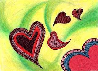
I sort of like this one, but the background isn't really what I had in mind when I started it, the yellow is a bit bright, and I am not sure the green swirls work. Then there is that blue. Repetition is one principal of design, and it really isn't a good idea to introduce a color and use it only once. I really think this would be a better design if I had been able to put the blue in another spot, but the blue was the last color I added and I wasn't able to put it anywhere else. An advantage that acrylic and oil paints have over pencil or even watercolors, you can rework an area with a different color if you find you don't like what was done.
So it was onto another card:
 |
| Hearts#2 |
On this one I used more ink to provide detail, I also left some areas without any color. But I find the plain background a bit boring. Still I didn't want to add another color so I have just left it as is with the texture of the applied pencil creating some interest. Since I wasn't satisfied with the background on this one I decided to try at least one more time.
 |
| Hearts#3 |
The card above is the last one I have done so far, not much color and much more pen. I used stippling for the background texture and some crosshatching to darken the interior of the hearts to give value contrast. So far this one is my favorite though I probably spent less time creating it then I did the others.
You can see that each card is a bit different from the original design. I played with size, orientation and placement of the hearts on the surface as I created each card. Right now I am not sure if I will continue playing with this theme or not. Not quite sure I have finished exploring what I can do with these shapes on a surface. Actually I am thinking about moving some of this exploration onto fabric. Comments and suggestions would be gratefully received.


No comments:
Post a Comment