Sunday, March 9, 2014

Analogous Colors in Use, mostly


This months theme for the Sketchbook Challenge blog is Warm - Cool using analogous colors. First I want to say that I have no trouble picking analogous colors (they are the colors that sit next to each other on the standard color wheel). I have painted color wheels and know the 12 standard colors used by heart.

But I find analogous colors boring unless you use more colors than one probably should. Usually when picking analogous colors you select just three, red, red orange, orange for example. For above sample I have more like 7 starting with red and ending with green.

So I started with three, starting with red and added through yellow, semi OK as those are all "warm" colors, but I just wasn't happy when it came to the actual painting. It just wasn't working. So I thought I would slip a bit and added a yellow green, still not enough oomph so I slipped some more and added a darker green, oops as that pushes the color range into the "cool" (green, blue, violet) side of the wheel.  I seem to be able to manage the cool pallet, see the ATC (Artist Trading Card) below, but have a hard time just using the warm (red violet - yellow) colors by themselves.

I may try again to create a warm drawing with just colored pencils, but think that I will probably still not be happy with this color pallet. I much prefer using triads or split complementary colors, they add more zing and visual interest to my way of thinking. Reds just pop more when you add green (its complement) to the mix.
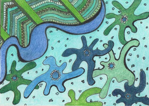

Above is the ATC I made using cool analogous colors. Am I happy with it, no, in fact I don't really like it at all. I am not pleased with the shapes I used or the overall look of the piece. The colors go together, and I tried to used as many as I had on hand in the same color families (green, blue green, blue) but still this just lacks spark. I suppose it was an interesting exercise but that is about it.


The above is just a doodle I made in the sketchbook but I had fun playing with it. I did the pen work first then added some color with colored pencil. Colors don't really fall into any formal selection, red-orange, yellow and green, but I think they work together anyway, maybe because there is lots of white. Anyway life would be boring if colors could only be put together based on the classic color groupings. Don't get me wrong those groupings work, mostly, but really, should they be the only way colors are selected? Nature certainly doesn't pull out a color wheel when flowers are growing wild in a meadow.

Back to the design I don't think it would work as a wall paper, too busy, but it might be a fun fabric, esp. if the white background was a more neutral beige, or perhaps a pale blue. I was just playing, but thought you might like to see.


Above photograph was made a week or so ago. It is a light coating of new snow on top of a pile of old snow. I just thought the textures and shadows were interesting.

That is it for today, per usual comments are welcome.

Wednesday, March 5, 2014

More from the Laundry-mat and other


I have finished reading Drawing on the Right Side of the Brain. Did I learn anything, well yes and no. I already knew how to draw negative space, and did most of the drawing exercises she gives when I took Drawing I, but hadn't realized prior to reading this book that when I am in drawing mode I don't think names of things and the reason why we mostly don't chat at the live sessions is because everyone is in R brain mode and language isn't available.

Also learned a proportion for ear placement with a side view portrait that I don't remember being told before. Not sure how useful that will be but hey one never knows. Also picked up that nostrils are mostly in line with the inside of eyes, don't think I knew that one before either.

I have started to read a book on Constable, we will see how that goes. He is known for his landscapes both watercolor and oil so I am hoping for some tips.

Above is a rather quick colored pencil sketch/drawing that lets me think spring, as the weather certainly hasn't been at all spring like where I am. Thankfully we didn't get hit with the last snow storm but it has been cold, below (well below at night) 32 degrees F for the most part.

This is from a photograph I made last spring at Borderland State Park and is a window with reflected daffodils, inside were some blooming geraniums. The drawing is rather impressionistic partly because I didn't want to spend the time trying to get photo-realistic and partly because the reflected flowers were already impressionistic.


Anther still life pen and ink drawing from the WetCanvas Pen and Ink Forum monthly challenge. This time tomatoes and peppers in a basket. I didn't spend a lot of time on the basket, just didn't have the desire to spend the time on it to get it really right. Not good I suppose but at least I am getting more art work done this week than I managed last week.

Done in my sketchbook with technical Pens, I used the 00 and the 3x0.


Ah yes laundry, that never ending chore. Was at the Laundry-mat on Monday washing some clothes, thankfully it was a bit more populated than the last time I was there. I tried drawing some faces with limited success but did manage to make this drawing of an older woman sitting on one the chairs waiting for a machine to finish. Since I haven't been getting out to my weekly figure drawing sessions I figured I had better start finding another way to practice the figure.

Not totally displeased with this, keep in mind I was trying to draw her without her realizing it. Drawn in a small sketchbook with a Micron pen.


Walking home last night from a visit to the Library I made this photograph of an almost setting sun. I really wanted to capture the look of the sun a bit earlier when it was round ball of light covered with clouds, but the camera didn't capture that image very well so I selected this one instead. I do like the light effects here so I guess it isn't too bad.

That is it for today, per usual comments are welcome.


Sunday, March 2, 2014

A Landscape and Two Still Lifes


I have been taking a bit of a break from art, well the creating part, drawing, painting and pen and ink. Finishing the Chipmunk last week was a bit intense and I needed to sit back a bit and recharge.

It wasn't a total break I spent a fair amount of time reviewing photographs for future drawings, reading discussions on the WetCanvas Watercolor forum and reading a book. I am reading Drawing on the Right Side of the Brain by Betty Edwards, so even if I haven't been creating much art I have been thinking about it.

I am finding the book interesting though for me not all that instructive, have to say that I think it is probably an excellent book for someone who thinks they can't draw. Course one would have to do the exercises, reading how to draw doesn't teach anyone how to actually do it unless they step up and draw.

Anyway in the middle of the week I worked on a couple of quick still life drawings, but just couldn't seem to find the motivation to work on my watercolor paintings or to start a new graphite drawing.

Today for the first time since I finished the chipmunk I was able to motivate myself to put pencil to paper for more than a few minutes. The above drawing is one result. I am thinking about making this a more finished drawing but wanted to spend a bit of time doing a fairly quick study of it to see how it would work.

From a photograph I made last summer at Ames Nowell State Park in Abington, MA. I made a series of photographs of this woman and her dog, this is the one (slightly modified) that I liked best. Though there is another with the dog jumping off the end of the dock that I have thought about using. Now I have to decide if I want to do a more finished version but I think the composition works even though the dog is watching someone out of view. Actually I am thinking about doing a pen and ink version of this, but have to think on that a bit longer as there are some tricky bits that I am not sure if I could get to work in pen and ink.


Above is the pen and ink still life that I managed to work on mid week, an apple, a pear, an orange in a wooden salad bowl. Obviously I didn't spend very long on this. I was going to do a more finished graphite drawing of the same set up, but it never really happened. At this point the pear has been eaten so I don't think I will ever finish the pencil drawing of this subject.


Another still life, for this one I pulled a small bake bean pot out of the cupboard along with a small single serving pottery casserole dish and a wooden spoon. Not sure how accurate this drawing is, the surface I put the objects on was at a bit of a slant and I have to think it didn't make my objects easier to draw.

I am thinking about doing some photographs with these, at the very least I will probably use them for drawing subjects again maybe I will add some onions and dried beans to the mix.


As a close this photograph of a couple of sparrows sitting in a bush. The building behind is a small church. The sparrows love taking cover in the evergreen bushes in front of the church and the hedge around the building across the street, so there is almost always a small flock of birds resting here. Even if I don't see them I can hear them twittering away.

That is it for today, per usual comments are welcome.